Pocket UX Case Study: Pumpkin Carving App Design
- Oct 27, 2023
- 3 min read
Updated: Oct 31, 2025
A Halloween-inspired UX challenge blending research, AR, and spooky UI design magic.
TLDR
This Halloween-themed UX/UI case study explores how to design a mobile app for pumpkin carving enthusiasts - from finding the perfect stencil to preserving your jack-o’-lantern masterpiece. “Carve It” was a two-week Pocket UX challenge where I used rapid research, sketching in Procreate, and dark-mode UI design in Figma to bring an idea to life.

🕸️ Problem Statement
How might we design a mobile experience for users who want to carve a pumpkin for Halloween — but don’t know what design to choose, what tools to buy, or how to make their pumpkins last longer?
UX Design Process - Pumpkin Carving App Design
Even for a short creative sprint, I followed a classic UX process - scaled to fit the challenge:
Empathize → Define → Ideate → Design → Test
1. Empathize
Competitive & Market Analysis
I reviewed existing pumpkin-carving and virtual-carving apps, noting gaps in usability, tutorials, and personalization. Most apps focused on entertainment over practical help - leaving room for a hybrid “learn + create” experience.

User Research & Pain Points
To validate assumptions, I:
Read app-store and social-media reviews about carving frustrations
Posted polls & open-response questions on Instagram Stories
Reviewed top Google searches for “pumpkin carving tools” and “how to preserve a pumpkin”

Key Insights - Users wanted:
🎃 Design inspiration that fits their skill level
🎃 Easy access to tools and supplies
🎃 Tutorials on technique and pumpkin preservation
2. Define
Project Goals
The “Carve It” app aims to:
🎃 Help users find and preview designs to carve.
🎃 Guide them to local or online stores for carving tools.
🎃 Provide tutorials and tips for preserving their pumpkins.
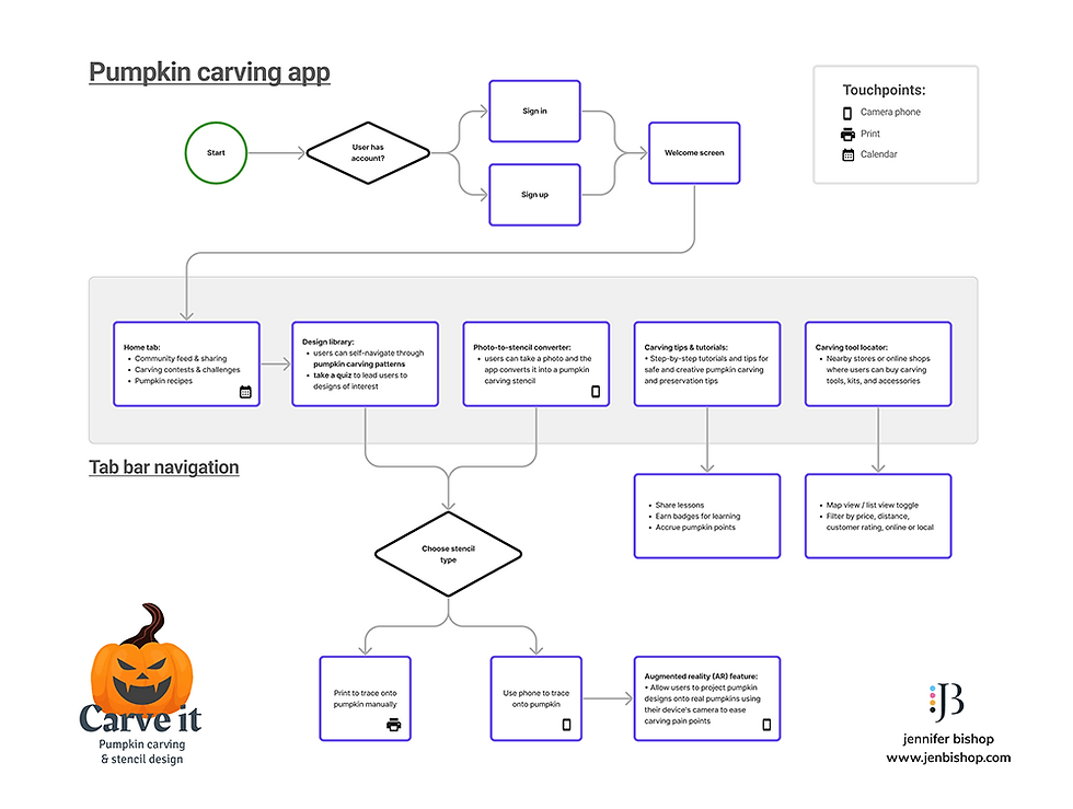
Task Flow
A lightweight flow visualized each feature and identified off-app touchpoints (shopping, sharing, tutorials) to ensure continuity across the user journey.
3. Ideate
Sketching & Wireframes
I sketched core screens in Procreate, layering quick grayscale layouts and annotation notes - my favorite way to think visually and iterate fast.
Concept Highlights
🎨 Design Library → Select Pumpkin Design
📱 AR Stencil Projection via Camera
✨ “Design Style Quiz” for personalized recommendations
🛒 Map for local tool shops + links to online stores
🎥 Video tutorial library on carving & preservation


4. Design & Prototype
UI Kit / Mini Style Guide
I embraced dark mode to amplify the Halloween aesthetic while letting vibrant oranges glow.

Brand Elements
🕸️ Logo: Animated faces to mirror carving creativity
🔤 Typography: Rakkas (Display) + Signika Negative (UI copy)
🎃 Icons: Outlined line style to reflect tracing & stencil themes
💜 Color Palette: Purples paired with pumpkin orange accents
High-Fidelity Screens
Built in Figma for iOS, featuring home, design library, quiz, and AR camera views.


5. Test & Feedback
I shared the prototype online for community feedback and began small-group usability testing. Early feedback confirmed strong visual appeal and easy navigation, with curiosity around how AR projection would perform on a real pumpkin surface.
🔮 Results & Next Steps
This quick Halloween UX case study reinforced how a playful, seasonal concept can still follow a rigorous design process.
Lessons Learned:
Dark mode can elevate theme emotion when balanced with readability.
AR features need real-world surface testing early.
Rapid research + visual prototyping can create surprisingly complete concepts in under two weeks.
Next, I’d love to explore whether an AR stencil projection could adapt to curved surfaces - and maybe even partner with a developer to bring “Carve It” to life.
Until then… may your designs be hauntingly delightful and your pumpkins perfectly preserved. 👻🕷️🎃
Disclaimer: The thoughts shared in this blog are solely my own and do not represent the perspectives of my professional relationships or clientele.
Comments